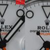
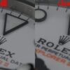
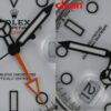
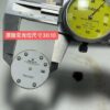
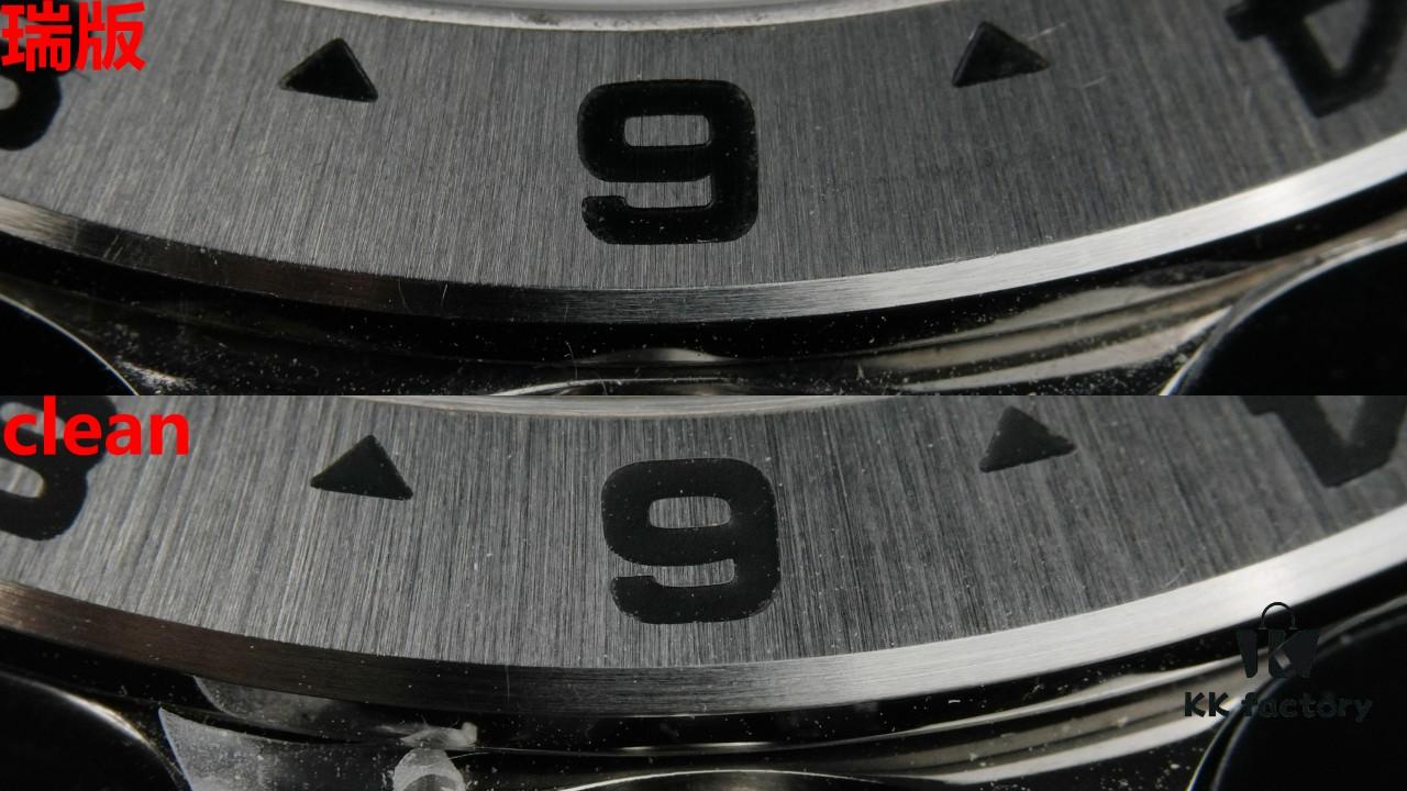
There is no visible difference to the naked eye in the markers and printing, as a layer of black paint covers the underlying finishing discrepancies. From the side view of the markers, the Swiss version appears slightly more rounded. Font differences are negligible, except for the letter ‘E’ in the orange text (second to last character), where a variation exists—this stems from an issue with the original reference used for mold creation (see Figure 8), as the master dial had already been dismantled and discarded. In terms of hands’ three-dimensionality, tip sharpness, and luminescent fill, there is no significant difference; the ‘short-flat-convex’ criterion is no longer applicable for authentication. On the side of the hands, excess white paint is more noticeable on the Swiss version, whereas Clean’s finish appears relatively cleaner in this regard. Regarding the bezel brushing, the Swiss version is marginally finer, while paint filling shows no obvious distinction.
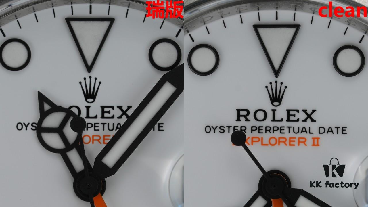
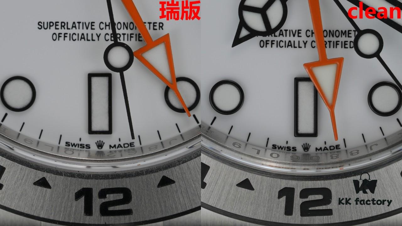
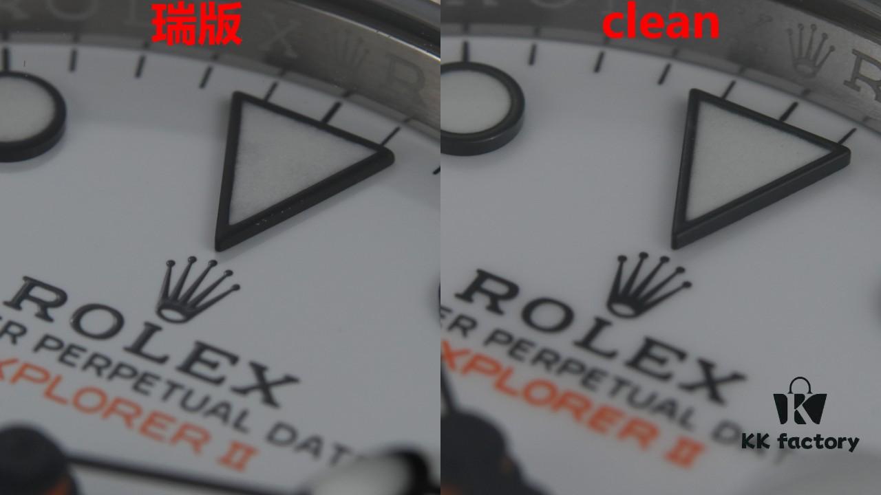
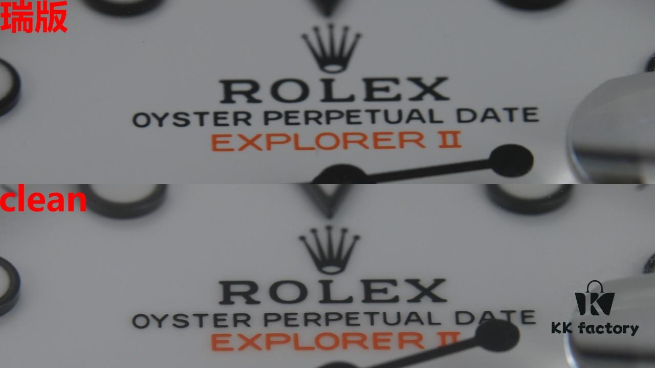
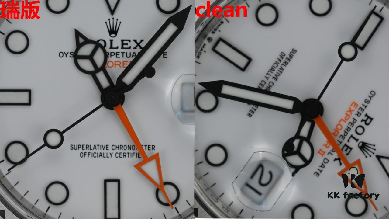
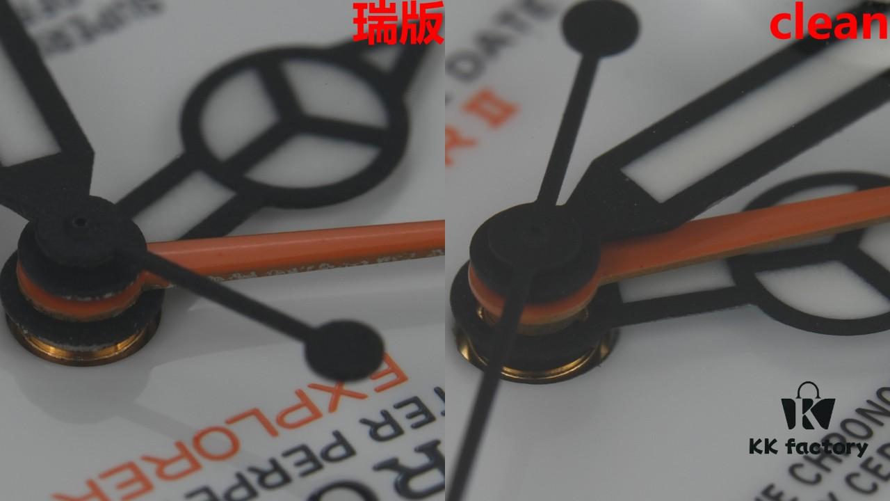
Clean Explorer II Macro Detail Comparison
$0.00
